


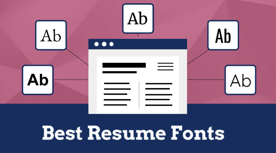
Fonts don’t just show words; they also express the tone, style, and how serious or professional something is. In design, like on websites or in print, picking the right font makes it easier to read and makes the message stronger. The same is true in the case of writing a resume The best fonts for resume enhance the overall and lasting visual representation, hence improving the accessibility and captivation of information for the viewers. In this blog, we will help you nail the perfect CV with the best fonts for resume that even experts stand by, so your resume never becomes the one thing standing in between an amazing job offer and you.


Perché è così importante scegliere i font migliori per il curriculum?
I font non solo comunicano il testo, ma includono anche tono, personalità e professionalità. Nell'era digitale, dove le persone leggono velocemente, usare un font chiaro e gradevole può catturare l'attenzione e far sì che il tuo messaggio venga recepito. Scegliere il font giusto dimostra che sei attento ai dettagli e che tieni a rendere il tuo contenuto sia informativo che presentabile, lasciando un'impressione positiva sul tuo pubblico. Font come Arial, Calibri o Times New Roman sono spesso usati perché sono facili da leggere sia nei materiali stampati che online. Usare un font coerente in tutto il tuo curriculum lo fa apparire ordinato e organizzato e assicura che tutto si adatti bene. Questo fa una buona prima impressione, rende il tuo curriculum più facile da leggere e ha maggiori probabilità di essere notato tra le altre domande di lavoro. Esplora Adobe per ottenere i migliori font per il curriculum.
Suggerimenti per scegliere i migliori font per il curriculum


Dimensione del carattere
Assicurati che il tuo curriculum abbia una dimensione del carattere appropriata per una migliore leggibilità. La dimensione del carattere migliore per il corpo del testo del curriculum è spesso compresa tra 10 e 12 punti, mentre il tuo nome e le intestazioni delle sezioni sono leggermente più grandi per evidenziarne l'importanza. Ciò garantisce la leggibilità mantenendo un aspetto pulito e ordinato per il tuo curriculum.
Coerenza
Assicurare uniformità nella selezione dei font nel tuo curriculum. La coerenza nello stile dei font produce un'estetica unificata e raffinata. Lo stesso dovrebbe essere mantenuto anche quando si tratta di usare grassetto, corsivo e sottolineato. Queste caratteristiche di formattazione dovrebbero essere usate spazialmente per aggiungere enfasi. Esplora Adobe per ottenere i migliori font per il curriculum
Rifletti la professionalità
Seleziona font che trasudino professionalità e siano in linea con gli standard del tuo settore. I settori creativi possono offrire maggiori opportunità per l'utilizzo di caratteri distintivi e stilizzati, mentre le aziende conservative tendono a scegliere scelte più convenzionali. L'obiettivo è raggiungere un equilibrio armonioso tra unicità personale e standard consolidati nel settore. Font fantasiosi come Chiller o Hand Script non hanno l'aspetto più raffinato e possono apparire poco professionali in un CV.
Bilanciare i caratteri Serif e Sans-Serif
Caratteri serif, come Times New Roman, sono comunemente associati a uno stile convenzionale e sono appropriati per il contenuto del corpo. D'altro canto, i font sans-serif come Arial possono essere utilizzati per le intestazioni per fornire un aspetto più contemporaneo. Questo abbinamento genera intrigo visivo mantenendo la leggibilità.
Limitare il numero di caratteri
Astenersi dall'utilizzare un numero eccessivo di caratteri distinti. Limitare l'uso dei caratteri a un massimo di due: uno per le intestazioni e un altro per il contenuto del corpo. Un numero eccessivo di caratteri potrebbe dare luogo a una presentazione visiva disorganizzata e poco raffinata.
Test di leggibilità
Prima di terminare il tuo curriculum, fai una copia cartacea e valutala per garantirne la leggibilità sia in versione elettronica che cartacea. Potrebbero essere necessarie delle modifiche a seconda del mezzo attraverso cui il tuo curriculum verrà osservato. Prova Adobe per ottenere i migliori font per il curriculum
Le scelte degli esperti per i migliori font per il curriculum
Times New Roman
Times New Roman is a serif font known for its traditional and professional appearance. Its clear and straightforward design makes it a popular choice for resumes. The font exudes a sense of reliability and timeless professionalism. It is also readily available on all platforms and can be used on most word processors. It’s a safe bet for individuals in conservative industries, projecting a no-nonsense vibe that is easy on the eyes. It does have a heavy serif feel, which may take up a lot of space on the resume and further deter the formatting of your text.
Avenire prossimo
Avenire prossimo è un font sans serif e mantiene un aspetto pulito e contemporaneo. Trasmette un senso di innovazione e lungimiranza, rendendolo adatto a persone in campi creativi o tecnologici, inoltre sta guadagnando rapidamente popolarità, il che potrebbe essere un grande punto brownie per il tuo curriculum. La sua semplicità ed eleganza contribuiscono a un'atmosfera di curriculum raffinata con i suoi contorni aperti e le linee nette. È un font premium, tuttavia, e ha un prezzo più alto.
Elvetica
Helvetica è un font sans-serif versatile e ampiamente apprezzato che bilancia modernità e leggibilità. Le sue linee pulite e la spaziatura uniforme trasmettono un senso di professionalità e ordine. Il font è ideale per le persone che puntano a un'estetica minimalista e pulita nei loro curriculum, il che lo rende un favorito per vari settori. Il font ha anche più opzioni di peso e quindi un singolo font può darti titoli, sottotitoli, corpo e altro. Potrebbe, tuttavia, giocare a tuo sfavore se sei relativamente più inesperto e non hai tutta quell'esperienza.
Cambria
Cambria is a serif font and strikes a balance between traditional and modern aesthetics. It’s good if you want your resume to look both classic and modern. People in jobs like law or finance often use it because it fits well with their formal style. It carries a sense of professionalism without feeling overly traditional. The font is also readable even in small sizes, so you can put in quite a bit of information without it taking up a lot of space. My favourite part about Cambria is the generous spacing and how it is so much easier to read than other serif fonts.
Georgia
With its distinct serifs, Georgia is a serif font that provides a touch of character and style to your resume. It’s known for its readability, especially in smaller font sizes. Georgia is an excellent choice for those looking to infuse a bit of personality into their resume while maintaining a professional and polished appearance. The font may not be your best bet, however, if you are applying for a more creative field, where it might look out of place.
Conclusione
Come esplorato in questo blog, gli esperti hanno parlato e il migliori font per curriculum che ottengono lavori in modo coerente in linea con chiarezza, professionalità e pertinenza del settore. Il fattore cruciale è nella selezione dei migliori font per il curriculum che si allineano al tuo campo specifico e dimostrano efficacemente il tuo livello di competenza. Tieni presente che il tuo curriculum è più di un semplice pezzo di carta; è la prima impressione che dai ai potenziali datori di lavoro. Seguendo i consigli dei professionisti e scegliendo il miglior font da utilizzare per il curriculum che trasmetta correttamente il tuo messaggio, puoi migliorare notevolmente le tue possibilità di creare un'impressione duratura e ottenere un'opportunità di lavoro molto desiderata. Dai un'occhiata alle nostre migliori scelte per i migliori font per il curriculum su Adobe oggi e ottieni il lavoro dei tuoi sogni. Per maggiori informazioni, visita Findwyse.


